I’m expanding my series featuring fantastic authors to include fantastically creative people across the different mediums, which is why I’ve invited the World Fantasy nominee Kathleen Jennings who is both a writer and an artist to drop by.
Watch out for the give-away question at the end of the interview.
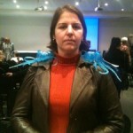 Q: In 2009 you won the Inaugural Kris Hembury Encouragement Emerging Writers and Artists Award. Kris attended one of the EnVisions (a mentoring workshop for writers) and worked on the Fantastic Qld committee as well as serving as president for the Vision Writers group. He had such a dry sense of humour. As an emerging writer and artist how did winning this award impact on you?
Kris was a friend, and so it was quite emotional and a huge honour – that’s the personal impact. As a writer and artist, the impact was in realising that what I did was in some way seen by other people. Both writing and art can be (to varying extents) highly subjective pursuits, and realising that it isn’t all happening only in my own head is like opening a window and getting fresh air. I think that sort of combined shout of “we see you!” and “come on in, the water’s fine!” from people further out is a big gift more experienced people can give to those just starting. And one of the best compliments I can give the SF writing scene in Australia is that I have always found them very warm, tolerant and encouraging to awkward and easily startled beginners.
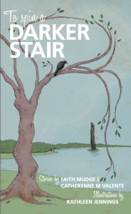 Q: Kathleen has been nominated for the World Fantasy Award in the Art section. When you were a child did you ever think you’d be nominated for the World fantasy Art Award and do your parents finally believe you’re a ‘real’ artist now?
I never even dreamed about it! I recall planning to be an author, or a champion poultry-breeder, or something like that.
As for my parents, they always thought of me as a real writer, so I think the art just required a slight readjustment. I suspect they are slightly disappointed that now they just get to show their friends copies of my pictures, instead of holding them down and reading high-school essays to them. They are recovering gracefully, and fantasy art is sometimes more generally socially acceptable than fantasy writing, but I suspect they’d really like to see my art on a book with my name on it.
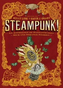 Q: Your short stories have appeared in ‘Antipodean SF, the Shadow Box anthology, Andromeda Spaceways Inflight Magazine #41 and #52, After the Rain, Light Touch Paper Stand Clear and a comic in Candlewick Press’ Steampunk!.’ You were the president of the Vision writers group in 2009, 2010 and 2011. How useful is belonging to a group for the development of a writer?
I found it very useful – it’s another of those things which teaches a distinction between subjective and objective assessment of my work. It took me out of my own head (and writhing self-referential angst) and taught me how to write better, how to be dispassionate about editing (this lesson hasn’t entirely taken yet), how to put my work out there and receive comment on it, and also how to tell the difference between genuine constructive criticism and the personal taste of the reader. But more importantly, it was the beginning of a great many friendships and personal and professional connections, as all the people grew up and out and graduated into new stages of their careers, new pursuits and interests, sharing dreams and ideas and projects. I remember Catherynne Valente wrote a beautiful review of Midnight in Paris, and said of the dream it shows of the literary/artistic scene in 1920s Paris, that as writers “this is what we are meant to get instead of health insurance!”. And it is, but we also get to build it fresh each time for ourselves.
Q: You have done covers and illustrations for Small Beer Press, Subterranean Press, Fablecroft Press, Andromeda Spaceways Inflight Magazine, Ticonderoga Publications, Odyssey Press and the Canberra Speculative Fiction Guild as well as individual commissions. Can you walk us through how someone would approach you to commission work?
It starts with an email or a twitter message, although sometimes there have been oblique advance hints given at a convention or over coffee. I panic (either from surprise or scheduling) then say yes, give a quote (once there’s enough information) and get the brief. This includes dimensions, details of style, particular limitations, directions the publisher/client would like to go in and the date. The date is very important! “As soon as possible” is not a date, it is a shifting target on the far side of other dates (this is a public service announcement, in case I forget to ask for one: everyone is happier with dates!). There is a varying degree of freedom – anything from “whatever you want” to “precisely these scenes”. For covers, I do like some idea of preference or at least direction. It helps to narrow my focus and the restrictions give more scope for creativity. Also, the cover is for marketing as well as decoration, and it’s good to know what the publisher’s thoughts are in that direction. Good art direction is invaluable. Then I read the manuscript (although once or twice this hasn’t been an option), weep, angst, do several thumbnail sketches, send them for approval and – sometimes after some back-and-forth (usually by email, rarely and delightfully over coffee) – get started on the final sketch which will develop into the final artwork.
 Q: I used to work as a graphic artist illustrating children’s books and write. I eventually found the answer to the question: Was I an artist who wrote, or a writer who drew? (See Kathleen’s sketch books). Which do you see yourself as? And do you think it matters?
I see myself as a storyteller (or at least, a lover of stories) who works in words and pictures. My favourite works in all media (art, writing, music, architecture, landscape gardening…) either tell, suggest or provide scope for a story. When I write, I sometimes plot in pictures. When I draw, I try to get a story in there (at least in my mind) – something beyond the purely ornamental. Oddly, although I enjoy comics, I prefer heavily illustrated prose at present – possibly due to circumstances surrounding the last comic work I did (mild heat stroke at one end and floods at the other)! Perhaps the illustrated novel gives more scope for imagination in the space between words and text? I have not analysed this yet.
I do find it difficult to do both, but this is purely because of time constraints (I have a day job, and there are more art deadlines). The writing gets done but I am learning that I have to be much more structured to make the editing happen. But it is happening!
Art and writing complement each other well. It’s nice to be able to switch when I get plunged into creative despair in one area. But I also harbour the hope that the rise of ebooks will somehow elevate the importance of beautifully produced hard-copy books, with elegant design, typography, illustrations, initial capitals and endpapers.
Also, it’s beautiful to be able to interact with my favourite writers as an artist, and my favourite artists as a writer, because that’s pretty much the only way I’m able to string two words together in their presence.
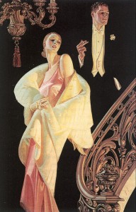
Q: You have said your influences are Brett, Leyendecker and Sender. I love Leyendecker’s work. (He did the Arrow Shirt adverts and many covers for American Weekly). Eg. Having struggled to make ends meet as an illustrator, this picture is one of my Leyendecker favourites:
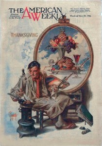 Of course, Leyendecker was highly successful and made a good living from his art. But that was back in the day when the American Weekly needed painted covers. (It was also back in the day when a short story writer could make a living as a writer). What is it about Leyendecker’s art that appeals to you?
Truthfully, it’s the hard edge he gives to paintings of soft curls. I had a book of fairytales when I was little, and the illustrations had a similar amazing richness – the “Cinderella” was the three-ball version, each dress was more beautiful and gold-embroidered than the last, but mostly I remember the angular painting of the hair, and the square toes of the stepsisters’ satin shoes. When I discovered Leyendecker, I fell in love with him for that. I also love the visible brush-strokes in sleek pictures, the combination of intense drama with dignity, and the sense that if he took himself seriously it wasn’t in a dull way – there’s this edge either of humour or superciliousness in the most elegant pictures which (for all the formal poses and decorative arrangements) adds tension and therefore an element of story to his pictures.
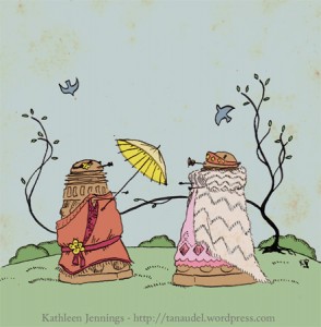
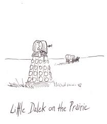
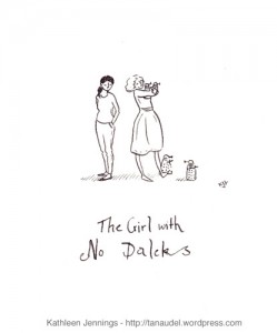
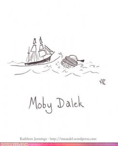
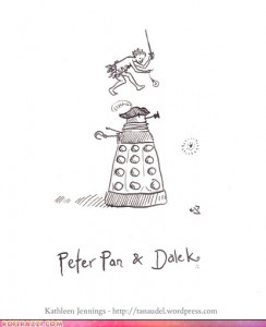 Q: You have done a series of cartoons with Daleks as the central theme (these were shortlisted for a Ditmar). Why Daleks?
They are simple and implacable, which makes them wonderful recurring villains: predictable, consistent, unstoppable. But – well, I never thought I’d draw a connection between Leyendecker and the Daleks! – there is a note in their voices that isn’t robotic. It isn’t “you will be assimilated”, it isn’t unvarying. There’s a rising note of anxiety to it, panic, real hatred. Inside those shells are these neurotic balls of intense, obsessive emotion. It creates that same Leyendecker tension between the presentation and underlying feeling. So – I’m a fan of Daleks.
As for the use of Daleks in the game (it was nearly, and may one day be, ducks) – I like parlour games, word games, lying-around-and-being-silly games, so tossing the Daleks (who didn’t do anything to deserve it) into a series of unlikely scenarios amused me vastly.
The rest of the game is an excuse to muse about books I love, or tropes in genre, or memories of reading around the table when I was growing up.
 Q: Your art has been shortlisted for a Ditmar and won the Ditmar Award for: ‘Finishing School” in Steampunk!: An Anthology of Fantastically Rich and Strange Stories’. Do you have a favourite amongst your covers or illustrations and if so, why?
Generally, the second-last one. The last one is a victim of temporary trauma-induced amnesia, the current one is just traumatic and I’ve learned so much in doing each cover that I get a little eye-twitch looking at some of the earlier ones! My favourite parts of covers are usually anything new I was allowed to get away with, and the back.
Among the covers, my current favourite is probably the cover for Subterranean Press’ 10th anniversary edition of Kelly Link’s Stranger Things Happen. I was very excited to be asked to draw it because I’m a big fan of Kelly’s writing (although I tend to write very fragmented stories after I’ve been reading hers – the structure of “Kindling” in Light Touch Paper Stand Clearwas a victim of speed-reading Stranger Things Happen for this cover), and then to be allowed to get away with a two-tone, wallpaper/toile effect that I’d been wanting to try! Also, there’s a lightness to the linework which I’m always working to achieve in finished work instead of just in sketches, and I’m still fond of the peacocks on the back cover. And I love the typography (which isn’t my doing!). It’s very gratifying to have good typography put with your art – I have a theory that good typography can save bad art, but good art can’t necessarily lift bad typography.
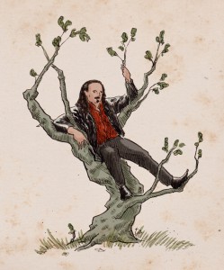
I’m still recovering from the trauma of Midnight and Moonshine, but I am very happy with how (under duress!) it developed the style which Small Beer Press and Sofia Samatar made me discover for A Stranger in Olondria. I learned a lot doing the cover for Olondria, and still view it through a filter of “if I were to do it again I’d…”, but there are parts of it of which I am excessively fond – certain squiggles of colour, the light through a window, the subject matter.
 Q: I was prompted to start this series of interviews because there seems to be a perception in the US and the UK that fantasy (in books) is a bit of a boy’s club. I’ve come across quite a bit of talk on the blogs recently about female comic artists and writers, and their lack of representation in large companies like DC (where the money is). Have you come across this in your professional life?
I haven’t directly. However, professionally I’ve been raised by writers, which in terms of my illustrations is basically like being raised by wolves. Also, although I’m very aware of the tensions in the comics worlds, I came into comics through short story anthologies so haven’t strayed into that scene. A lot of the women whose work I like are in the illustrative/graphic scene and there appears to be a lot of support and collaboration without regard to gender, so perhaps it is less gendered there? Also, with the fantasy side of illustration the delicate, elegant, beautiful and decorative is highly prized. You’d think something described with those words could easily be segregated into “women’s work” but isn’t at all (think Charles Vess!) and that’s wonderful. And even the sentimental end of that spectrum has a lot of men working in it so there doesn’t seem to be that danger of being “women’s art”. But again, I’m working mostly from printed evidence. I’ll be able to report further once I know more about that community.
 Q: Following on from that, does the gender of the writer/artist change your expectations when you approach their work?
I’m aware that I have held some of the prejudices I referred to in the answer above! I suspect these are hold-overs from some experiences in the writing scene. So I’m usually trying to hold these at bay, not get exasperated by sentimentality or chain mail bikinis as a knee-jerk reaction, or be thrilled at discovering a harder edge in a picture drawn by a woman, or sensible clothing in pictures drawn by a man. I draw sentimental pictures! I have drawn chain mail bikinis! And my favourite things – beauty anchored by fleshy reality or a low rumble of tension, ugliness liberated by common sense or incredible observation – appear in my favourite pictures by my favourite artists, and are usually fairly evenly gender-distributed.
Q: And here’s the fun question. If you could book a trip on a time machine, where and when would you go, and why?
I don’t think about this much! My father discouraged my sister and I from saying “I wish”, because it meant we weren’t happy with the way things were. And if we said we weren’t happy, well then obviously something should be done about that. Which led to some interesting home alterations. However! although I’m fascinated by much of the past, it’s usually the inconvenient parts, and I’m a big fan of modern medicine, amenities and so forth (I get this from my mother, who refused to go camping as it was primitive enough at the house).
So where would I go? I think I already mentioned Midnight in Paris? But oh! I don’t know. Probably not the future (which is odd, because I always like to be very well prepared for upcoming adventures). So – yes – probably that threshold age of the 1920s, when the world was just becoming recognisably ours, and was damaged and new and leggy, hopeless, hopeful, decadent, rebuilding, pragmatic but still with an eye for beauty, taking to the skies. As for where – England for Sayers, or Melbourne for Lindsays, or anywhere with an active literary/artistic community.
Or else just an evening (last weekend, or the last convention, or home, or some recent café) full of conversation and pen-and-paper games, songs, plotting, coffee, cupcakes, genre snark, story-telling, cider, word origins and drawing on serviettes.
Give-away Question: How should words and pictures work together?
Give-away: A little ink drawing of a famous quote with a word replaced by “duck” (artist retains right of veto/negotiation on quote, because I don’t have time to draw 14 ducks again – you don’t realise how many ducks that is until you have to draw them, but it is a lot of ducks).
Follow Kathleen on Twitter: @tanaudel
See Kathleen’s Blog
See Kathleen’s sketchbooks

![midnight-and-moonshine-web[2]](http://www.rowena-cory-daniells.com/wp-content/uploads/2012/09/midnight-and-moonshine-web2.jpg)